
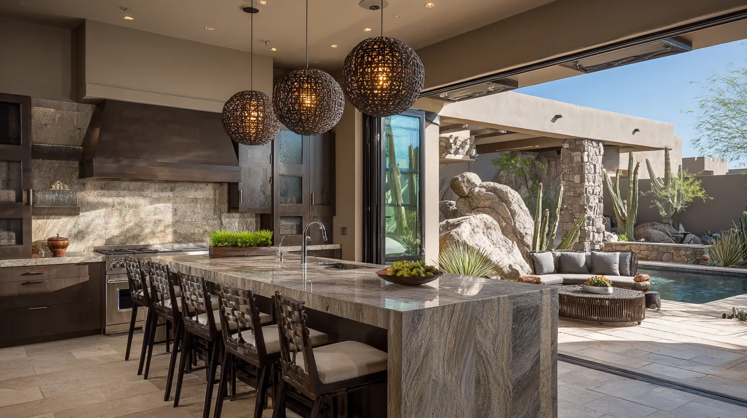
Living room color mistakes usually come from choosing each element separately instead of viewing the room as one connected palette. Paint, upholstery, flooring, wood tones, metal finishes, and natural light all influence how color appears. Avoiding a few common errors can make the space feel more balanced, comfortable, and intentional.
Choosing Paint Before Reviewing Fixed Finishes
Wall color covers the largest area, but it should not be chosen first in isolation. Flooring, fireplace stone, cabinetry, and large upholstery pieces are harder and more expensive to change. Identify the undertones in those fixed elements, then select paint that relates to them. A cool gray wall beside warm beige stone, for example, can make both colors look less appealing.
Ignoring How Light Changes Color
A swatch viewed under store lighting cannot predict how a color will behave at home. North-facing rooms often make colors appear cooler, while strong afternoon light can intensify warm shades. Test large samples on more than one wall and view them morning, afternoon, and evening. Check the color with lamps turned on as well, since bulb temperature can shift its appearance.
Using Too Many Colors at Equal Strength
A room can include several colors without feeling chaotic, but they should not all compete for attention. Choose one dominant color, one or two supporting colors, and a smaller accent used with restraint. Repeating key shades across textiles, artwork, and accessories helps the palette feel connected. Strong colors are easier to manage when quieter neutrals give the eye a place to rest.
Matching Every Surface Too Closely
Perfect matching can flatten a room and make it feel overly coordinated. Instead of repeating the same beige, blue, or gray everywhere, use related tones with clear differences in depth and texture. A sofa, wall, and rug can belong to the same color family while still providing contrast. Variation helps furniture and architectural features remain visible rather than blending together.
Skipping a Whole-Room Sample Check
The final mistake is approving colors one item at a time. Place paint samples, fabric swatches, rug references, wood tones, and metal finishes together before committing. Look for an undertone that feels disconnected, an accent that dominates, or too little light-dark contrast. A successful living room palette does not require perfect matching; it needs a clear relationship among the colors already in the space.
Disclaimer: The content provided in this article is for informational purposes only and is not intended as financial, tax, or investment advice. JL Coates is not a financial advisor, tax consultant, or investment specialist. We recommend consulting with a professional financial advisor, tax specialist, or investment advisor to discuss your specific circumstances before making any financial, tax, or investment decisions based on this information. JL Coates assumes no responsibility for any actions taken based on the information provided in this article.
