
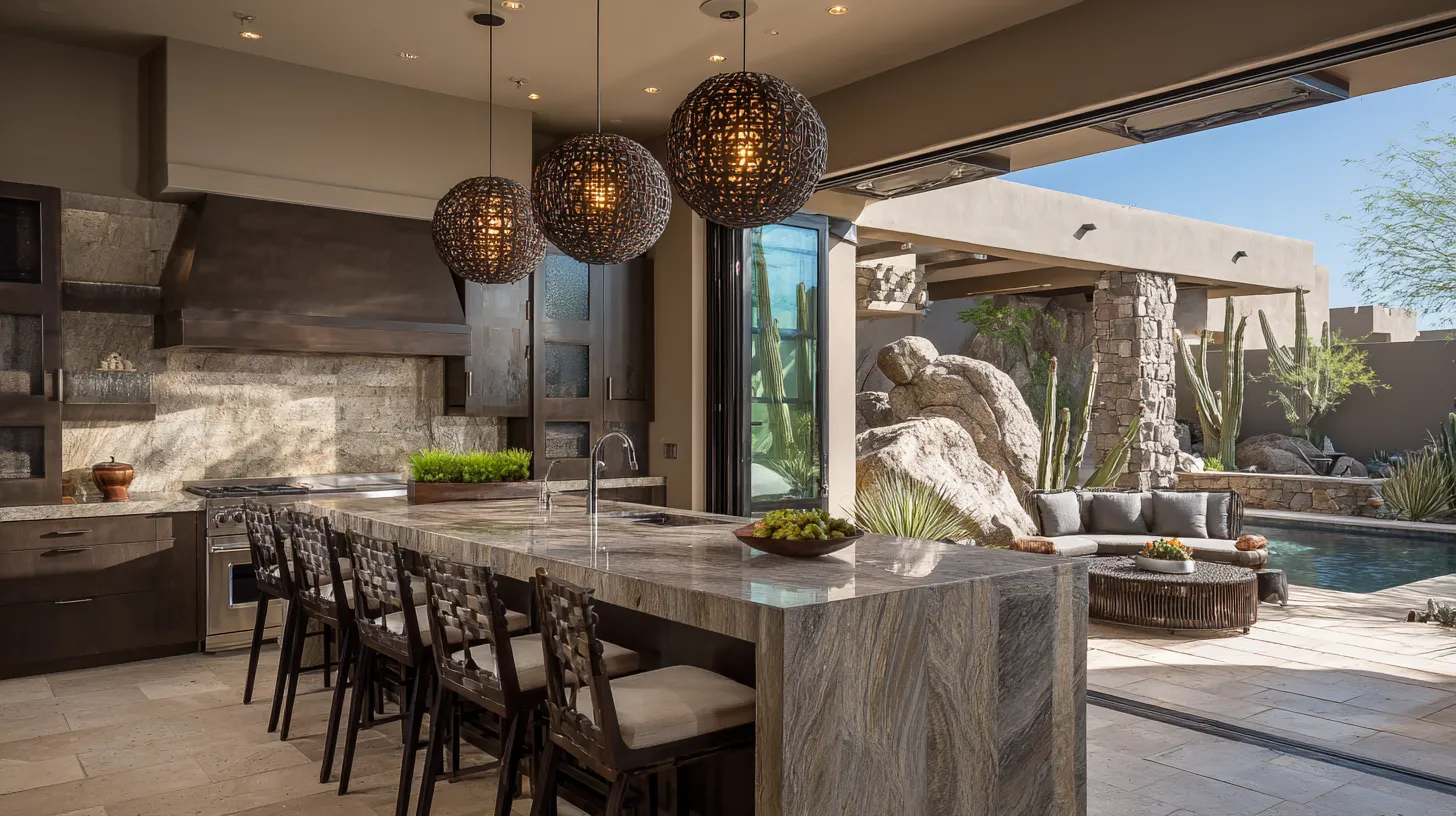
A room tends to look more refined when its colors feel intentional, balanced, and connected. Warm whites, greige, taupe, muted blue or green, deep brown, charcoal, and near-black are reliable choices. Their impact comes from controlled contrast and consistent undertones, not from choosing the darkest or trendiest shade. A limited palette usually looks more polished than several unrelated colors.
Begin with layered warm neutrals
Warm white, ivory, mushroom, greige, and taupe create a quiet base that works with wood, stone, metal, and woven materials. These shades feel softer and more dimensional than a stark white-and-gray scheme. The important detail is undertone. Compare samples beside flooring, countertops, and upholstery throughout the day. A warm neutral can appear pink, yellow, or green under different light, and an obvious mismatch can make the room feel unsettled.
Choose muted colors with complexity
Muted hues often read as more refined than bright, highly saturated colors. Dusty blue, slate, sage, olive, clay, burgundy, and softened plum have enough gray or brown in their mix to feel grounded. Use one of these colors on walls, cabinetry, or a large upholstered piece, then repeat it in smaller details. This creates depth without making the palette busy. In open rooms, slightly muted colors also transition more smoothly from one area to another.
Add depth with dark accents
Charcoal, ink navy, espresso brown, and near-black can sharpen a room when used selectively. A dark interior door, built-in cabinet, fireplace surround, or narrow feature wall gives lighter colors a stronger outline. Deep colors also make brass, pale stone, and warm wood appear richer by contrast. Keep the dark shade connected to something else in the room, such as hardware or a fabric pattern. Isolated dark elements can look accidental instead of deliberate.
Keep the palette limited and consistent
A refined room usually needs only three color roles: a dominant base, a supporting tone, and a darker or more distinctive accent. Repeat those colors across paint, textiles, furniture, and accessories instead of introducing a new shade at every turn. Match warm colors with warm undertones and cooler colors with compatible cool undertones. Finish matters too: smooth walls, even coverage, and thoughtfully chosen sheen help color look its best. Expensive-looking color is ultimately less about a particular shade and more about restraint, repetition, and careful coordination.
Disclaimer: The content provided in this article is for informational purposes only and is not intended as financial, tax, or investment advice. JL Coates is not a financial advisor, tax consultant, or investment specialist. We recommend consulting with a professional financial advisor, tax specialist, or investment advisor to discuss your specific circumstances before making any financial, tax, or investment decisions based on this information. JL Coates assumes no responsibility for any actions taken based on the information provided in this article.
