
What the 2/3's rule actually controls
The rule helps align visual weight. When a smaller item is roughly two thirds the width or length of a larger anchor, the pair typically reads as connected rather than accidental. This matters most in living rooms because the space is made of “sets” that must feel cohesive: sofa and rug, sofa and artwork, seating and coffee table, console and television, or fireplace and surrounding furnishings. The goal is a calm hierarchy where the anchor looks intentional and the supporting pieces look correctly sized.
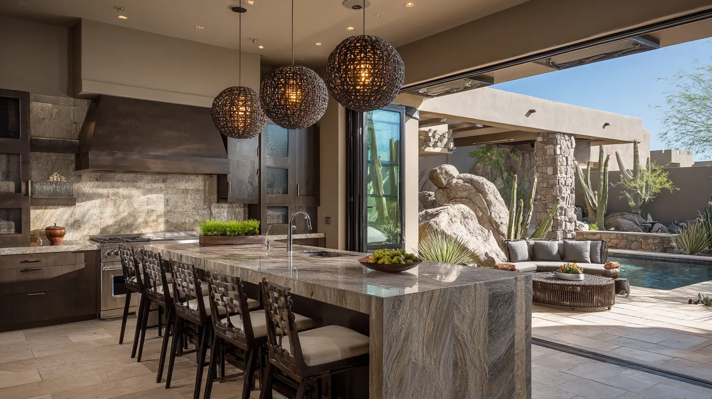
Best places to apply it in a living room
Over a sofa, artwork or a grouped arrangement usually looks most settled when it spans around two thirds of the sofa’s width. At the center of a seating group, a coffee table that is about two thirds the sofa length tends to look proportional and keeps the ends of the sofa from feeling unsupported. For rugs, the two thirds concept works as a reality check: if the rug only covers a small fraction of the seating area, the entire room can feel like it is floating. A correctly sized rug visually “locks” the furniture group together.
How to measure quickly without overthinking
Start by choosing the anchor first, typically the sofa or the main seating group. Measure its width, then calculate an approximate two thirds target for the related piece. Precision is less important than avoiding extremes. When a rug or artwork lands closer to one half, it often reads too small; when it approaches the full width, it can look heavy or overpowering unless the room is large and minimal. Use the rule as a range, then confirm with clearances: comfortable walking paths, door swing, and leg room around tables.
Common mistakes and how to avoid them
One common error is applying the rule to the wrong anchor, such as sizing artwork to a wall instead of to the sofa beneath it. Another is ignoring height and depth: a properly wide piece can still feel wrong if it is hung too high, or if a coffee table is so bulky that it crowds knees and walkways. Finally, mixing multiple focal points can break the proportion logic. If the room has a dominant feature, keep the strongest two thirds relationships clustered around it so the eye understands what is primary.
Quick decision guide for better layouts
Use the 2/3's rule to create a consistent scale language across the room, then let function finalize the choices. If the seating area feels disconnected, prioritize a larger rug that better claims the zone. If the sofa wall feels unfinished, adjust the artwork width and placement before adding more decor. If the room feels tight, reduce the visual mass of the coffee table or side chairs even if the two thirds target is correct. The best layout is the one that keeps proportions calm and circulation effortless.
Disclaimer: The content provided in this article is for informational purposes only and is not intended as financial, tax, or investment advice. JL Coates is not a financial advisor, tax consultant, or investment specialist. We recommend consulting with a professional financial advisor, tax specialist, or investment advisor to discuss your specific circumstances before making any financial, tax, or investment decisions based on this information. JL Coates assumes no responsibility for any actions taken based on the information provided in this article.
